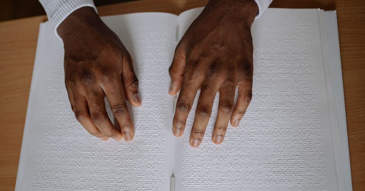
Two kinds of reader arrive at your website, and they have more in common than you would expect. One is scanning — glancing at the page for the two or three words that match what they came for, ready to hit Back. The other cannot see the page at all, and is listening to a screen reader read it at a speed you would find unintelligible, judging each heading and each link by its first few words.
Both are skimming. Both need the meaning at the front. Almost every technique that helps one helps the other, which is why this is the cheapest accessibility work there is: it is a copy edit, not a build.
Nobody reads your page
They scan it. The words that get seen are the ones that match the visitor's task, plus a handful of trigger words — free, price, near me, your town. Everything else is texture.
So write for the scan:
- One idea per paragraph, and short paragraphs. A single-sentence paragraph is fine.
- More headings than feel necessary, and headings that say something. "Our approach" says nothing; "What happens after you get in touch" says exactly what follows.
- Bullets for anything you would otherwise separate with commas.
- Bold the key term once, at first appearance. Bold everywhere is bold nowhere.
- Cut half the words, then look again. Most business pages lose nothing at all in the first pass.
And delete the happy talk — "Welcome to our website", "we pride ourselves on quality workmanship". If you can hear blah blah blah while reading it back, it is not carrying any weight. Replace it with something specific: not "quality workmanship" but "we tile a full bathroom in three days and hoover up before we leave".
Headings are the map, and for some readers they are the whole navigation
Screen-reader software can list a page's headings and jump between them. That means your heading structure is a table of contents, whether you designed it as one or not.
Two rules follow:
- Don't skip levels, and don't pick a level for its size. If the correct heading looks too big, that is a styling decision, not a structural one. Fix the styling.
- Front-load the meaning. "Emergency call-outs in Stoke-on-Trent" beats "When things go wrong (and how we help)" — because the first three words carry it, and the first three words are all a lot of readers get.
The test takes thirty seconds: read your headings alone, in order, and see whether they make sense as a list.
Link text has to survive being read out of context
A screen-reader user pulling up the list of links on your page sees exactly the words inside each link, with nothing around them. So a page with six "read more" links offers them six identical entries.
Write the destination into the link:
- ⛔ "To see our prices, click here."
- ✅ "See our fixed prices for websites and care plans."
Same for buttons and icons. A phone icon with no text, a magnifier with no label, a hamburger menu with nothing to announce — each of those is a control that some visitors simply cannot identify. If a control is icon-only by design, it still needs a name in the markup.
And do not make the link text a URL. "https://www.example.co.uk/services/bathrooms" gets read out character by character in some configurations, which is a genuinely miserable thing to inflict on someone.
Alt text: three questions, in order
Alt text is where good intentions produce the most noise. Ask, of each image:
- Is it decorative? A background texture, a divider, a flourish. Then its alt text should be empty — deliberately empty, so assistive technology skips it. Empty is a decision; missing is an accident, and missing usually means the file name gets read out.
- Does it carry information? A photo of your work, a chart, a diagram. Then describe the information, not the picture: not "bathroom photo" but "a small bathroom retiled floor to ceiling in white metro tiles, with the original window kept".
- Is it a picture of text? A price list, an offer, a quote saved as a JPEG. Then the text has to exist as real text on the page. This is the one that most often loses a business money, because search engines cannot read it either.
Two more: do not start with "image of" — the software already says that — and if the image is inside a link, the alt text should describe where the link goes, not what the picture shows.
Say it in words, never in colour alone
"Fields marked in red are required." "The green options are available." Around one in twelve men has some form of colour-vision deficiency, and for them those sentences carry no information at all.
Every time colour signals something, add a second signal: a word, an icon, a pattern, an underline. This is also why link underlines earn their keep — a link distinguished from body text by hue alone is invisible to a meaningful share of your readers, and unclickable-looking to plenty more.
Our own worst example, because it makes the point better than advice does
Our privacy policy contained this sentence: "your data is not used to make any automated decision about you".
In the light theme, the words in bold rendered white on near-white. Every heading and every emphasised term on that page did — a dark-mode typography style had been applied without a condition. The page passed our blocking accessibility audit, because that audit had only ever run in the other theme.
So for anyone reading in light mode, the sentence available to them was "your data is used to make any automated decision about you". A negation the reader cannot see does not soften a statement; it reverses it.
We found it by measuring the pixels actually painted behind every piece of text on all 24 templates, in both themes: 308 findings, 306 of them real, across 6,502 elements. It is the strongest argument we own for why the words and the rendering are the same job. You can write a perfect sentence and publish its opposite.
Plain English is not dumbing down
Plain words are read faster by everyone and are the difference between usable and unusable for readers with cognitive disabilities, readers with dyslexia, and readers who are simply tired or in a hurry. Practically:
- Prefer the short word. "Use", not "utilise". "About", not "approximately".
- Explain any trade term the first time you use it, or drop it.
- Keep sentences to one thought.
- Write numbers as numerals, and spell out what they mean.
- Expand an abbreviation on first use.
- Write dates in full — "3 September 2026", not "03/09/26", which means two different dates depending on where the reader lives.
The two-minute versions of every check above
- Read the headings alone. Sensible outline?
- List the links with no surrounding text. Do you know where each goes?
- Turn off images in your browser, or read the alt text. Does the page still make sense?
- Read the page aloud. Where you run out of breath, there is a sentence to split.
- Turn on the screen reader you already own — VoiceOver on iPhone or Mac, Narrator on Windows — and listen to your home page for two minutes. It is uncomfortable the first time and it is the most useful two minutes available to you.
Where Neubor fits
We write the copy for the sites we build, and we measure the rendered result — a blocking WCAG 2.2 AA audit at phone and desktop widths plus a pixel-level contrast probe in both themes, on this website and on all seven of our public demonstration sites, on every deployment. We publish what those gates measure, including when they catch us out, as they did on the privacy policy above.
If your site says the right things and you are not sure they are actually reaching people, get in touch. Related: the eight faults we find on almost every small-business website and accessibility without a rebuild.
Kieran Bourne is the founder of Neubor, a Stoke-on-Trent web development and AI studio building websites and assistants that win more work for small businesses across Staffordshire.